At a Glance
- Visualization is becoming critical for analytics and data-driven decision-making.
- There is no reason to collect data that will not improve decisions or operations.
- Properly displayed data lets users more clearly understand problems and provides an exceptionally useful way to solve them.
Some managers and designers mistakenly believe that more data is always better when it comes to solving problems. But that is only true if the data can be easily understood and acted upon.
In the industrial sector, continually improved technology, including smarter sensors and more computational capabilities, have made it easier and more practical than ever to gather reams of data (i.e., “big data”). Visualization has also become an important component of analytics and data-driven decision-making. But with so many new options, it is natural to question how industrial companies can best manage the vast amount of data available from sensors, machines and processes, and transform this data to actionable information. In other words, what should their stat strategy be?
Data Strategies
Data strategies for improving an industrial business fall into two categories: using data to improve the decision-making process or using it to improve operations. Defining and understanding the problem to be solved and the associated unanswered questions determines what data must be collected. Although there is no sense collecting data that will not improve decisions or operations, sometimes insights come from unexpected data sources, so it is advisable to cast a wider data-gathering net than may be initially anticipated.
Once the questions that need to be answered are clearly understood, it’s best to focus only on the data needed.
Data Sources
Industrial data is derived from several types of sources:
Edge automation data. Programmable logic controllers (PLCs), embedded controllers and associated sensor data provide raw machine-status data.
Industrial control system data. Supervisory control and data acquisition (SCADA) systems or historians can have years of records about machines.
Business application data. Higher-level manufacturing execution systems (MES), and enterprise resource planning (ERP) and enterprise asset management (EAM) system can contain data spanning company operations, including extended non-operational information such as whether an asset is under warranty or not.
User-based wearables and mobile device data. These devices can provide real-time data such as photos, videos and audio of machines for remote diagnostics.
Autonomous data. Drones can provide aerial video of defects in assets, while track-and-trace sensors monitor asset locations.
Open or web data. Externally available information such as weather and map data can identify asset location and environmental and other conditions affecting machine performance.
When developing a data strategy, users commonly identify the “ideal” data they need to answer their questions. It may be possible to get this ideal data directly, or if this is not possible, to get by with relevant data which can be manipulated and interpreted to provide the needed information.
With the right data available, the next stages of analysis can begin to answer: What happened (descriptive)? Why did it happen (diagnostic)? And what will happen next (predictive)?
Visualization provide an exceptionally useful way to answer these questions.
Descriptive Visualization
Descriptive visualization takes raw data and organizes it into a taxonomy—the classification of data into a structure and context that help users solve a specific problem by more clearly understanding the issues. Descriptive visualization is an important step in extracting information from data.
Once the data is gathered, users should develop a storyboard that defines the data flow and then create an associated intuitive user interface that is easily understood and actionable for the operators. Simple visualization is not enough; it must also make users aware of what actions to take. This means HMI screens must be designed to transform data into immediate insights, displaying information that will help operators achieve their purposes and goals at a glance.
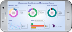
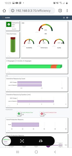
Descriptive visualization delivered through HMIs and SCADA systems is often associated with key performance indicators (KPIs), overall equipment effectiveness (OEE) scorecards and reports. Compelling visualization pairs meaning and insights behind the data with intuitive interfaces adapting to specific users and assisting in decision-making.
Advances in technology have expanded the options for data visualization by enabling multiple platforms and objects for viewing data. Traditional HMIs are dedicated devices panel-mounted in the field, or PC-based in a control room setting. Modern HMIs can be delivered anywhere via web browsers, mobile devices and wearable devices, offering new possibilities for data visualization, varied by user and device.
How the data is visualized is another matter. Some users want a simple tabular display of KPIs, while other are best served with a historical trend chart view of values. Other advanced graphics such as pie charts and spider graphs may better fit the need.
Data visualization has expanded to include multi-sensory and multi-touchpoint interfaces, and in the most modern implementations it is now possible to use virtual and augmented reality where information is available within the operator’s field of vision via wearables devices such as watches, helmets and glasses.
With the question of “What happened?” answered, the next step is to determine “Why it happened.”
Diagnostic Visualization
Diagnostic visualization works with data from various sources, including historical and real-time data, to build a cause-and-effect understanding, making it possible to learn from past behavior.
To do this, data analysis needs to detect abnormal events, changes or shifts in the datasets. Anomaly detection is identifying data or events that do not conform to an expected pattern in the dataset. These anomalies may be associated with equipment operation or with higher-level conditions. On a machine, if a motor experiences higher than normal power consumption, perhaps the drive or bearings are failing. For the controls, several failed log-in attempts to the HMI could indicate harmful cybersecurity activity.
Analytical systems establish baselines and patterns within data, making it possible to identify deviations and correlate whether a causal relationship is behind the anomalies. Modeling tools such as regression analysis, probability theory and time-series analytics are some of the methods used for this type of analysis. Diagnostic visualization dashboards encompass standard reports and charts such as time series, fault detection and cause analysis data.
The goal is to find the root cause for any anomaly by tracing the casual chain of events for a problem, such as unplanned downtime. In this way, independent variables leading to problems can be uncovered and procedurally addressed to address the issues.
With diagnostic visualization, it is possible to drill down into the exact root cause of the problem without having to determine if there is correlation. The challenge is for dashboards to accurately present all the relevant information so it can be easily understood. Although dashboards are the method for accessing data, diagnostic visualization is the tool for understanding causes and effects.
Once “why did it happen?” is understood, users will want to explore “what will happen next?” to know the best actions to take.
Predictive Visualization
Predictive visualization builds on the previous two steps, using data from both real-time and historical sources to provide insight on what might happen in the future. Predictive analytics helps determine the next best action to take to avoid an equipment malfunction or other issue, eventually leading to better operations.
Computational models must be developed to describe equipment and operation processes. Predictive analytics requires access to several data sources and lots of data to train these models. As an example, for a model predicting machine failure, the algorithm must be trained on historical data containing outcomes which have been identified or labeled as they relate to machine failure. For the model to predict machine failures, a good rule of thumb is to teach it with 10 times more examples than the number of data variables that affect the failure. If 10 data variables are involved, this calls for at least 100 examples of identified failures.
Predictive models need to be constantly improved for accuracy. If a model misses a certain failure type, the root cause of that failure should be fed back into the model to retrain it for this situation. Also, if data and business contexts change, then models might have to be re-calibrated to compensate for those changes.
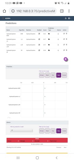
Ideal data is turned into useful knowledge when predictive visualization uses predictive analytics and dashboards. These dashboards must be clear, concise and comprehensive. Easy-to-understand dashboards provide meaningful insights into even complex predictive models with several data sources, because they present the information as a cohesive single source.
Predictive visualization takes the decision-making process from limited views of compartmentalized data to fully coordinated forecasts for future actions. Predictive visualization translates complex predictive models into a simple interpretation of analytical results.
Descriptive, diagnostic and predictive visualization offer an effective way to combine and interpret vast amounts of complex and disparate data sources so users can gain operational insights. The right data presentation drives better data-driven decision making and identifies trends before they happen. Digital transformation built on data presentation through visualization helps users increase revenue, eliminate downtime, reduce costs and maintain good customer service. Visualization is the best tool for summarizing data for effective decision making.
Marcia Gadbois is the president and general manager of ADISRA.


